Selecting the primary colors for the CDS was a relatively straightforward decision: we used flag blue and star red from the Chicago flag and included black and white for backgrounds and text.
But we need more than four colors to provide options for the range of print and web content produced by the City. Oglivy designed a color palette as part of their development of a base design system. We also pulled a set of colors from the USWDS palette.
To explain how we settled on the final CDS color set, we’ll first examine the Oglivy and USWDS options, then walk through how we combined them.
The Oglivy Palette
Oglivy’s goal: to develop a narrow and consistent brand identity for the City of Chicago that unifies digital assets.
Oglivy provided a minimal palette of three primary colors and three secondary colors with dark and light tones. Future designers and design projects would expand this color palette as needed. This palette would force a very unified look. However, we wanted to start from a less restrictive color palette.
USWDS Color Set
USWDS’s goal: to ensure accessibility across a large number of websites and brands.
The USWDS 2.0 color system palette is designed to be used across all digital assets and websites of the US government, and has over 300 colors. The USWDS also includes guidelines for accessible color use for achieving WCAG standards, including their “magic number” guidelines for contrast.
The CDS initially borrowed ranges of blue, red, green, yellow, and gray from the USWDS colors, adding a few Oglivy-selected primary colors. We needed to pare down the broad USWDS color selection to ensure a unified identity.
Combining color palettes
Goal: to ensure accessibility (USWDS) while providing a unique and clear municipal identify (Oglivy).
The final CDS color palette uses the four primary colors and the secondary tones identified by Oglivy and adds greens, golds, and additional tones from the USWDS palette.
Primary colors are those that define the new Chicago identity: flag blue, star red, black, and white. To avoid confusion, no other tints of flag blue and star red have been included. The primary colors are bold and easily identified with Chicago.
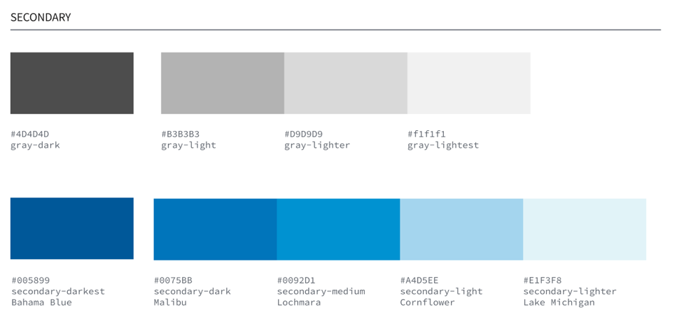
The secondary colors are supporting shades of blue and gray that help round out the design of web and print assets. Secondary colors are not used in logos or headers, and they should not distract from the primary colors. The grays were borrowed from USWDS, and the blues were chosen by Oglivy in a previous draft.
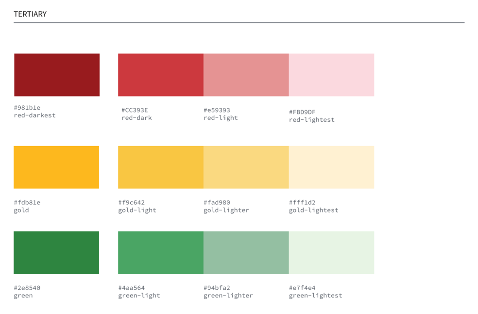
Tertiary colors are designed to give a palette for information and application design. The gold and green spectra are taken directly from the USWDS palette. The reds were altered slightly from the original USWDS colors so that they would be less similar to star red.
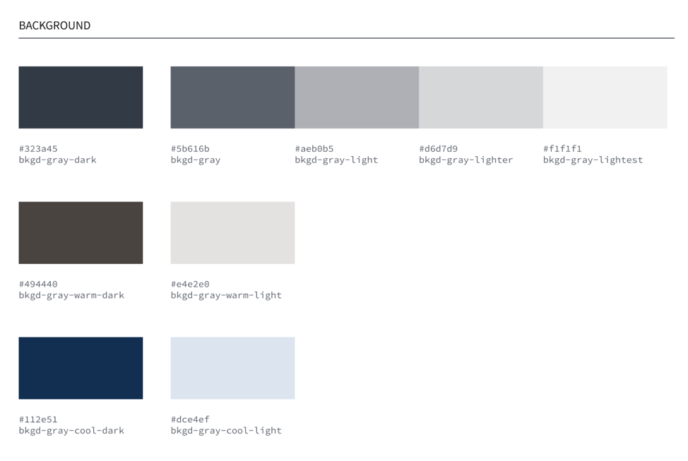
Background colors are borrowed from USWDS and are meant to provide a wider range of neutrals, including both warm and cool grays.
Want to use the Chicago color palette? You can view the color palette on Figma.