All assets
Brand Basics for the City of Chicago
The Star
The Chicago star is 14 inches tall with six points drawn from a circle six inches in diameter. The star’s points should be at 30 degree angles. See The Chicago Municipal Code CHAPTER 1-8 CORPORATE SEAL AND EMBLEMS. Specifically, sections 020 and 030 concerning the “Design of flag, emblems and badges” and “Municipal flag – Design requirements,” respectively.
Now, you are probably thinking to yourself, “Shut up and just give me the star so I can get a tattoo already!”
And I say to you: “No.”
?!?
This is way better: Visit the typography page.
There you can download Big Shoulders, our free, open source municipal typeface from Google Fonts and you can learn how to turn on discretionary-ligatures to make a perfect Chicago star every time in any color at any size. Boom! Way better.

Colors
Primary
Black
$color-black: #000000;
Flag Blue
$color-flag-blue: #41B6E6;
Star Red
$color-star-red: #E4002B;
White
$color-white: #FFFFFF;
Secondary
Gray Dark
$color-gray-dark: #4D4D4D;
Gray Light
$color-gray-light: #B3B3B3;
Gray Lighter
$color-gray-lighter: #D9D9D9;
Gray Lightest
$color-gray-lightest: #F1F1F1;
Bahama Blue
$color-bahama-blue, $color-secondary-darkest: #005B99;
Malibu Blue
$color-malibu-blue, $color-secondary-dark: #0075BB;
Lochmara Blue
$color-lochmara-blue, $color-secondary-light: #0092D1;
Cornflower Blue
$color-cornflower-blue, $color-secondary-lighter: #A4D5EE;
Lake Michigan
$color-lake-michigan, $color-secondary-lightest: #E1F3F8;
Tertiary
Red Darkest
$color-red-darkest: #981b1e;
Red Dark
$color-red-dark: #CC393E;
Red Light
$color-red-light: #E59393;
Red Lightest
$color-red-lightest: #FBD9DF;
Gold
$color-gold: #FDB81E;
Gold Light
$color-gold-light: #F9C642;
Gold Lighter
$color-gold-lighter: #FAD980;
Gold Lightest
$color-gold-lightest: #FFF1D2;
Green
$color-green: #2E8540;
Green Light
$color-green-light: #4AA564;
Green Lighter
$color-green-lighter: #94BFA2;
Green Lightest
$color-green-lightest: #E7F4E4;
Background
Gray Dark
$color-bkgd-gray-dark: #323A45;
Gray
$color-bkgd-gray: #5B616B;
Gray Light
$color-bkgd-gray-light: #AEB0B5;
Gray Lighter
$color-bkgd-gray-lighter: #D6D7D9;
Gray Warm Dark
$color-bkgd-gray-warm-dark: #494440;
Gray Warm Light
$color-bkgd-gray-warm-light: #E4E2E0;
Gray Cool Dark
$color-bkgd-gray-cool-dark: #112E51;
Gray Cool Light
$color-gray-cool-light: #DCE4EF;
States
Focus
$color-focus: #2C5491;
Visited
$color-visited: #4C2C92;
Icons
![]()
Public Mark
Our new public mark is the public voice of the City of Chicago, our residents, and our communities.


Department marks


Inter-agency
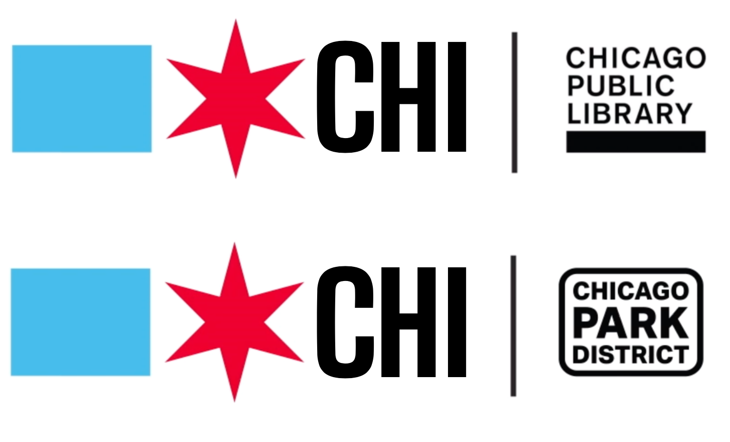
Community partnership & public expressions

Note: These marks are for example purposes only, there's no partnership or community favoritism implied or intended here.
Lockups
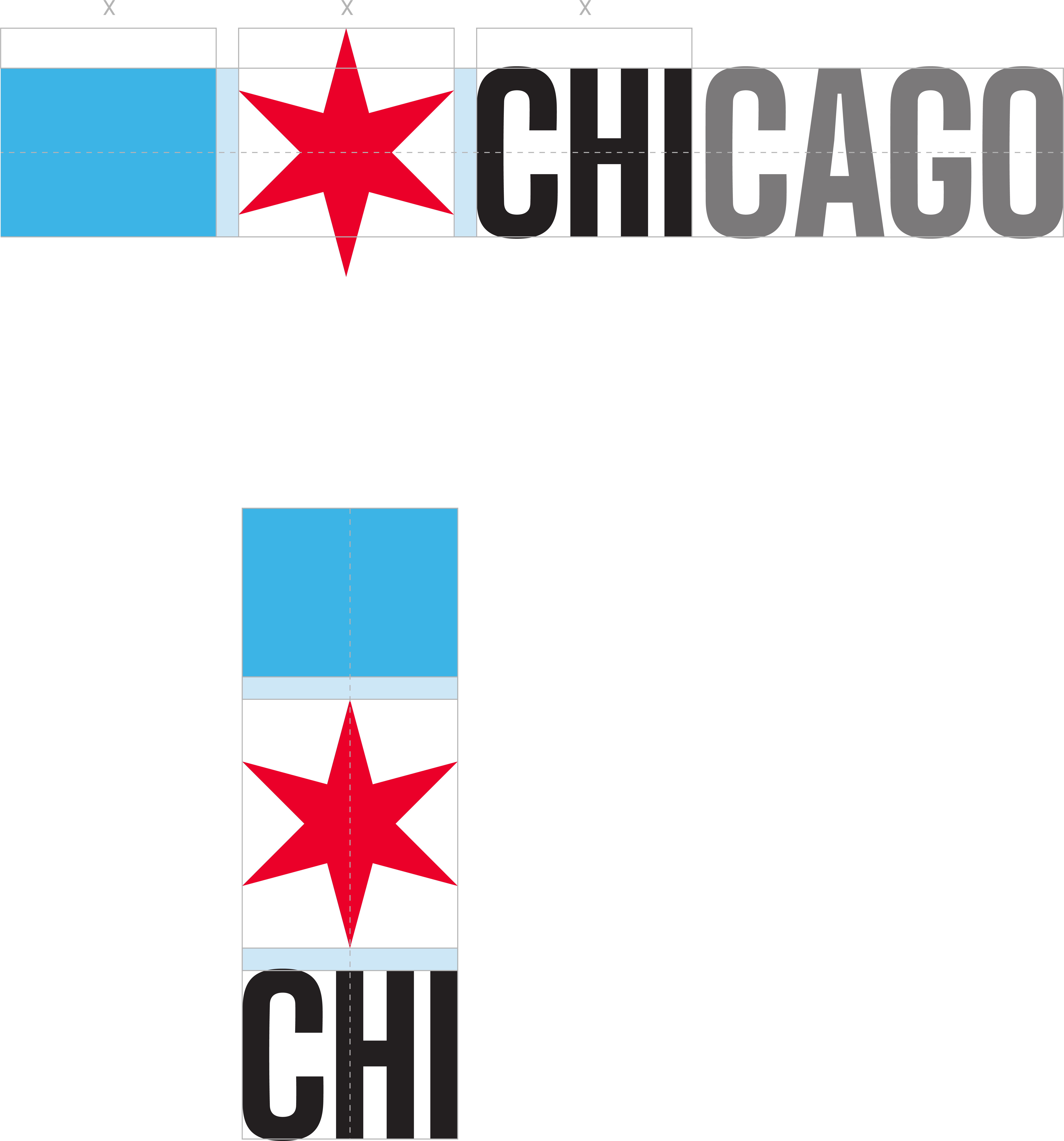
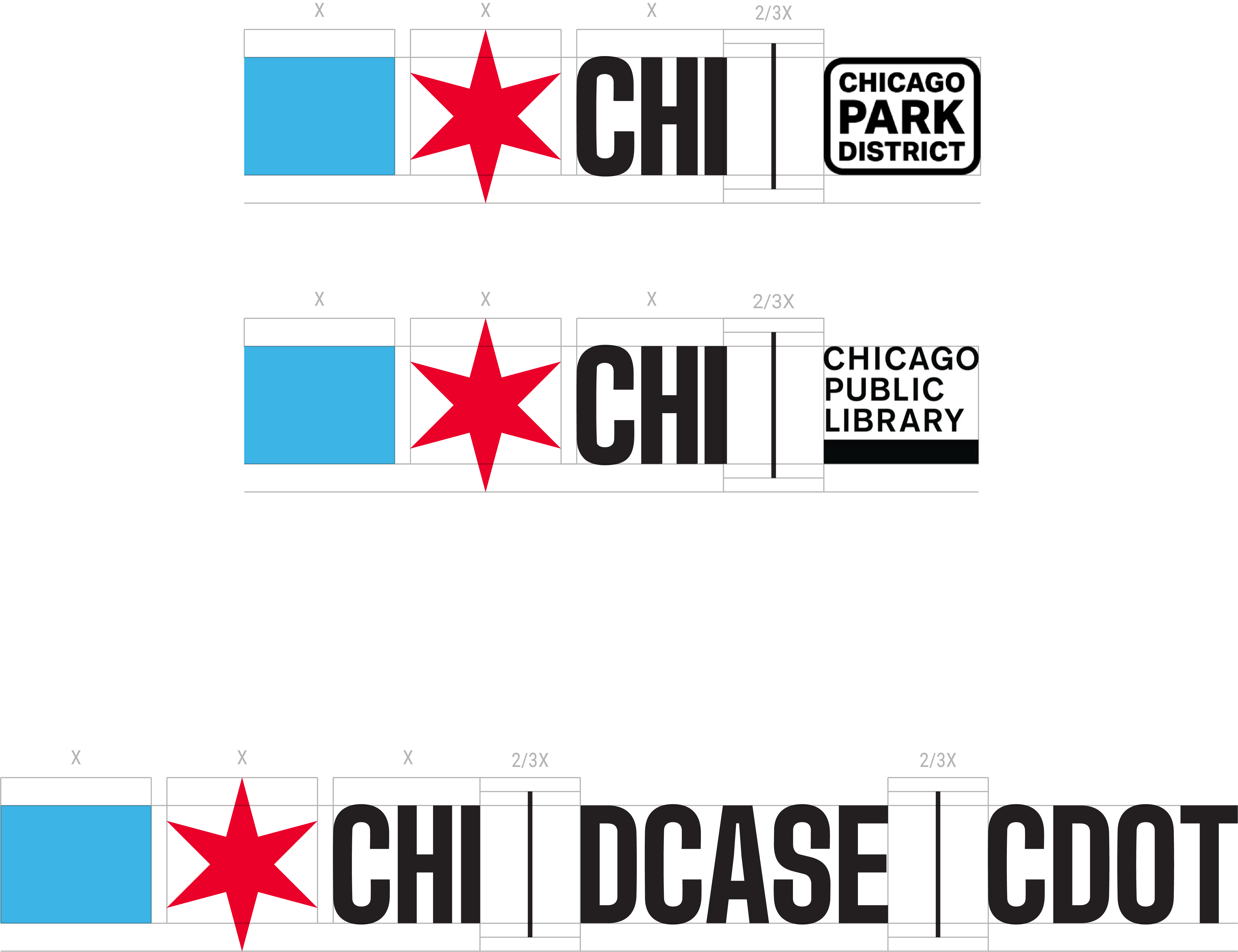
For ideal spacing in your project, use the follow guidelines for implementation:
Our municipal typeface

Big Shoulders is the Municipal Typeface for the City of Chicago. It is for use in headings, titles, banners, and posters. Setting type in all capitals is recommended.
Big Shoulders Display is for large format, environmental prints: signage, billboards, banners, etc. Big Shoulders Text is for all other display purposes.
Roboto and Lora are the City’s sans serif and serif body typefaces.
The next level up is to install the fonts on your own computer. The latest version will always be available on Google Fonts.
Resources
- Get Big Shoulders Display for large format, environmental prints: signage, billboards, banners, etc.
- Get Big Shoulders Text for all other display purposes.
- Get Roboto and Lora, the City’s sans serif and serif body typefaces.
To put a Chicago Star in your typesetting, turn on discretionary ligatures in your app or CSS, and then type CHISTAR (in all caps). It’ll automatically replace with the star, sized correctly to fit the text.
Now, you can make ASCII art, or get tatooed with exactly the right Chicago Star.
=======
CHISTAR CHISTAR CHISTAR CHISTAR
=======
If that didn’t work, these images show the difference betweeen turning ligatures on and off. In this case, in Figma.
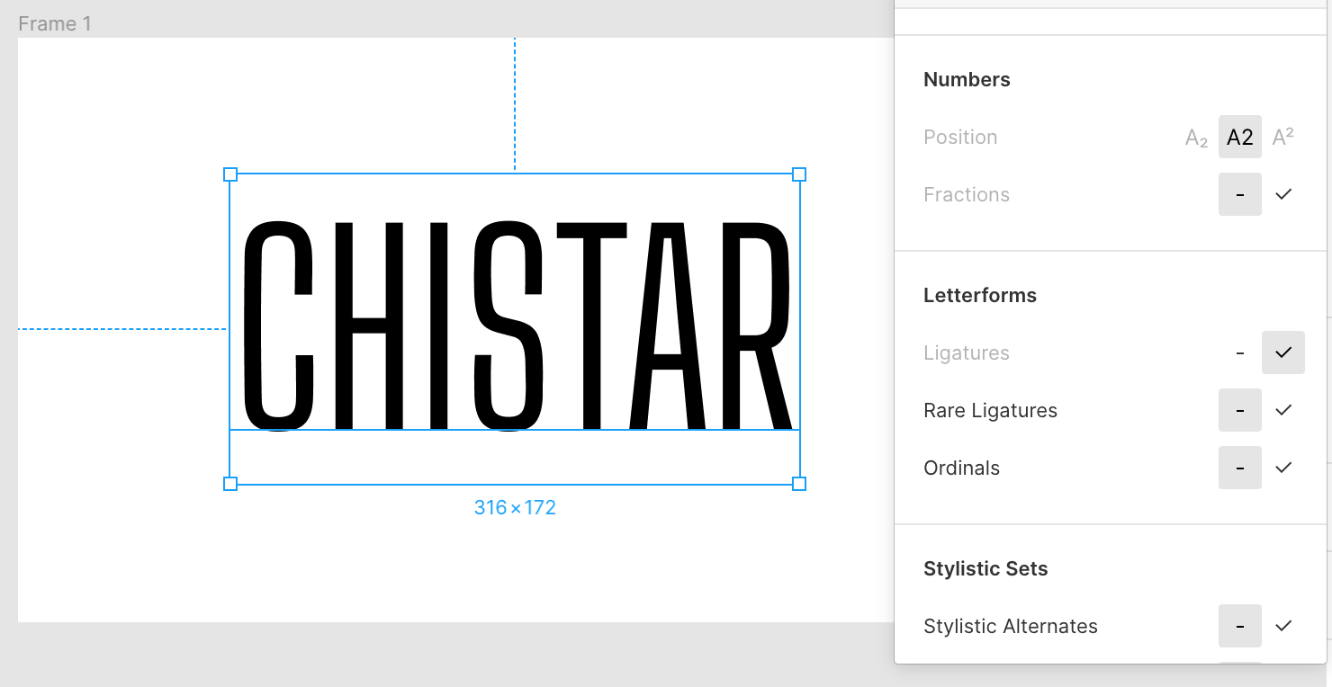 Ligatures off, CHISTAR.
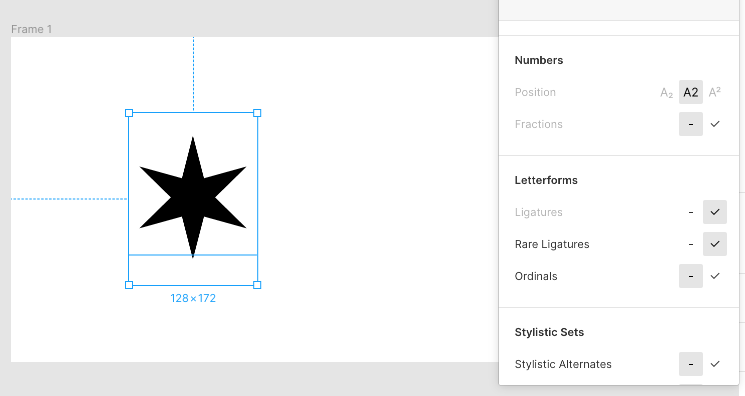 Ligatures on, our Chicago Star!
Here is an example Figma file. Note: you cannot turn on ligatures in Google Docs. :(
City Heraldry
The Flag of the City of Chicago
By https://cs.wikipedia.org/wiki/User:-xfi- - according to a design specified by Wikipedia user John Reid or T. E. Whalen’s) construction sheet (Municipal Flag of Chicago), which is in the public domain, and thus represented here.
For more details on the history of the flag, see Robert Loerzel’s wonderfully comprehensive The Story of Chicago’s Four-Star City Flag.
Tanner Woodford, Executive Director of the Design Museum of Chicago, had this contribution to share with us, an outline of the dimensions of the Flag:

I don’t mean to disagree or spark debate, but I think Robert & Tanner & T.E. may need to compare notes with us at the City and arrive at a final determination. I volunteer to mediate it in 2020 or beyond, or find someone with appropriate gravitas to do so, certainly.
Learn more about our flag and others’ lesser flags
- Roman Mars gives a famous talk on vexillology here, complimenting our flag
- The Municipal Code of the City of Chicago defines our municipal flag in Title 1, from 1-8-020 to 1-8-041.
- Wikipedia article
The Municipal Device of the City of Chicago
Learn all sorts of amazing Chicago facts about the Municipal Device and other aspects of Chicago at our awesome Public Library’s site. Introduced in 1892 as part of a Chicago Tribune contest, the Device was enshrined in our Municipal Code in 1917, along with the flag. The Municipal Device was intended for public re-use, to show our pride. During the next century, though, the flag stole our hearts.

An image of the Municipal Device, courtesy Chicago Public Library.
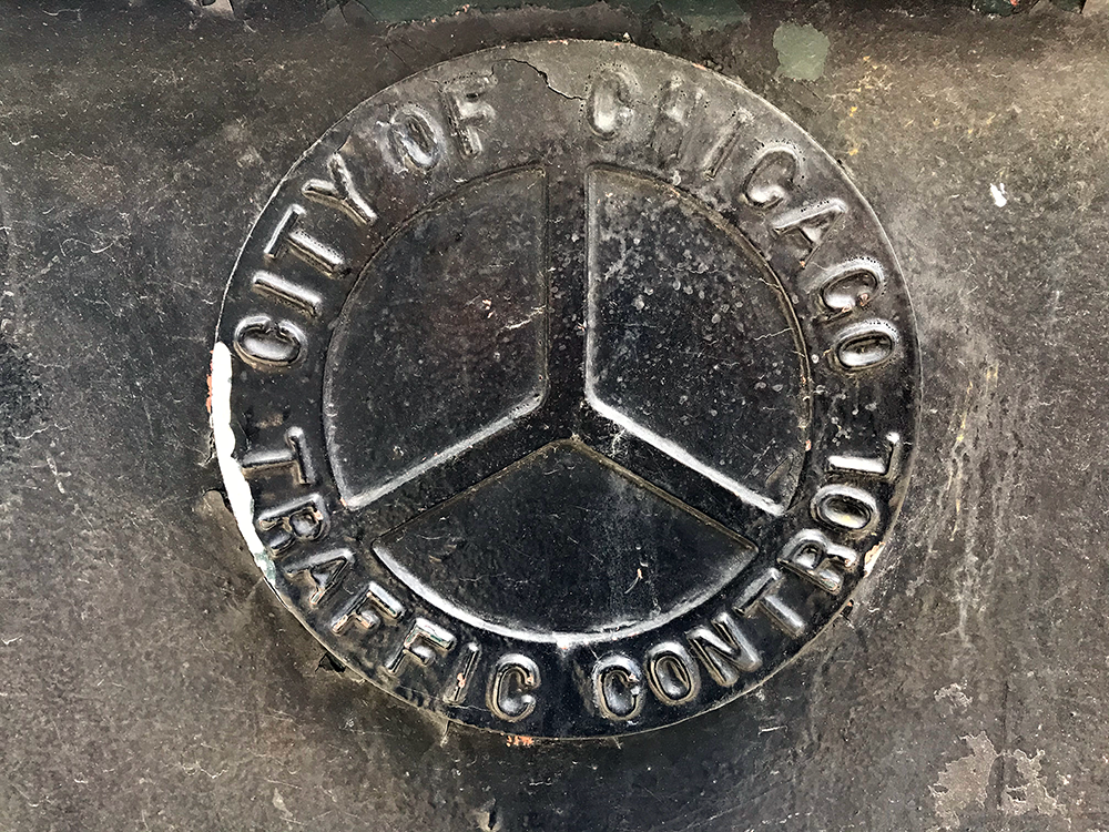 Photo of an Upside Traffic Control Municipal Device at intersection of State Street and Van Buren Street
Hippies doomed the Municipal Device with their peace symbol, which resembles the upsidedown Municipal Device favored by many of the industrious City Departments. They took pride in the engineering feat of reversing the flow of the Chicago River, and inverted the municipal device, later it was hated by Chicago Police in the 1960s…
Moving on… here’s an early example of a Municipal Device with the center ‘Y’ in red. That was the traditional depiction of the device, until they realized it was easier to make the whole thing white instead of terra cotta down the center. The Columbian Exposition needed white ones, and so here we are. All this is rumor I’ve heard from researching this project, chatting with Tim Samuelson and various librarians. Cool cats, all.
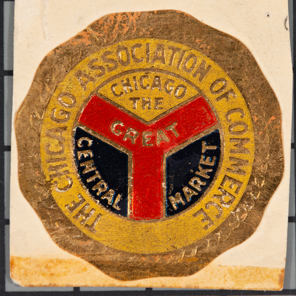
Original Municipal Device from the the Chicago Association of Commerce’s Great Central Market.
Other folks who geek out about symbols have lots to say about this one:
- WBEZ: Chicago’s municipal device: The city’s symbol lurking in plain sight
- Forgotten Chicago: wonderful example pics of the device
- The Geographic Society of Chicago
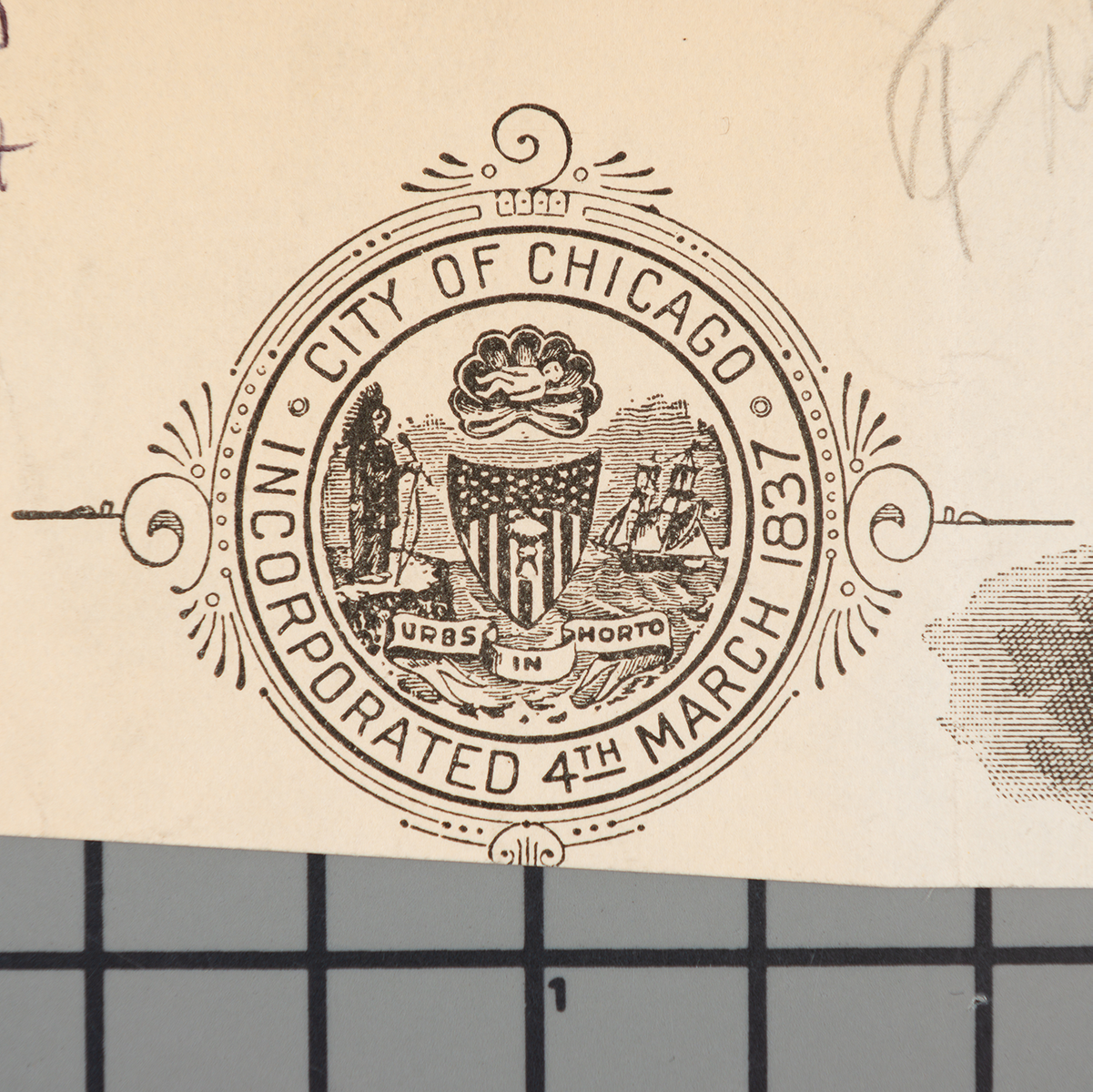
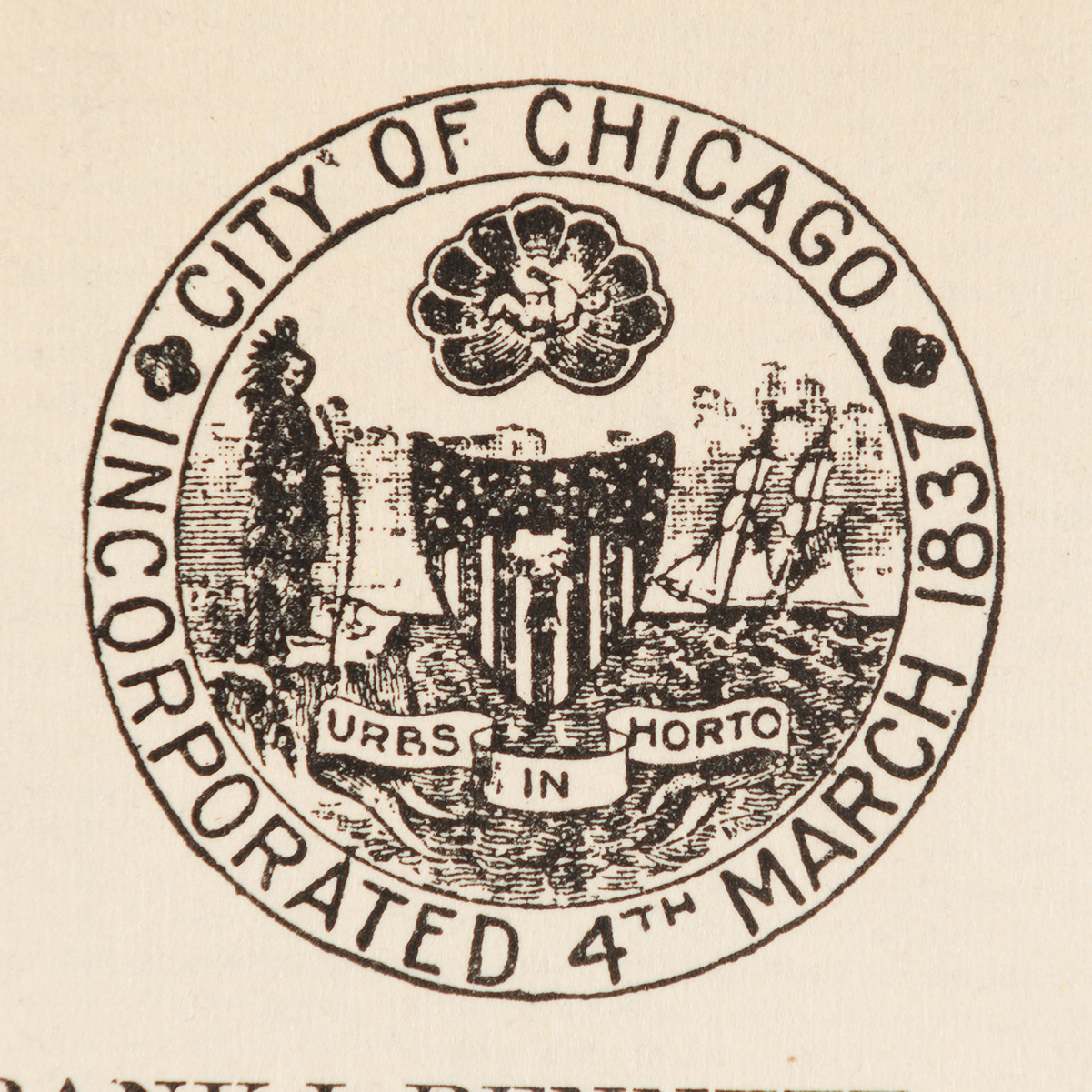
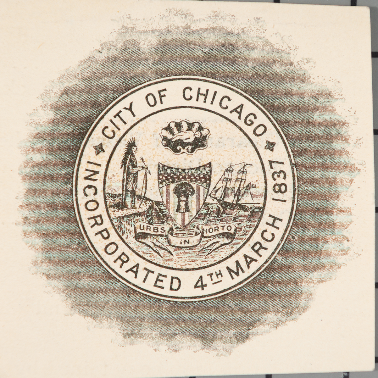
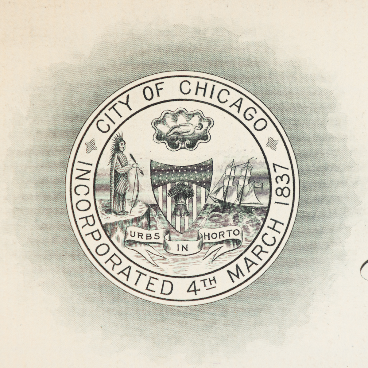
The Seal of the City of Chicago
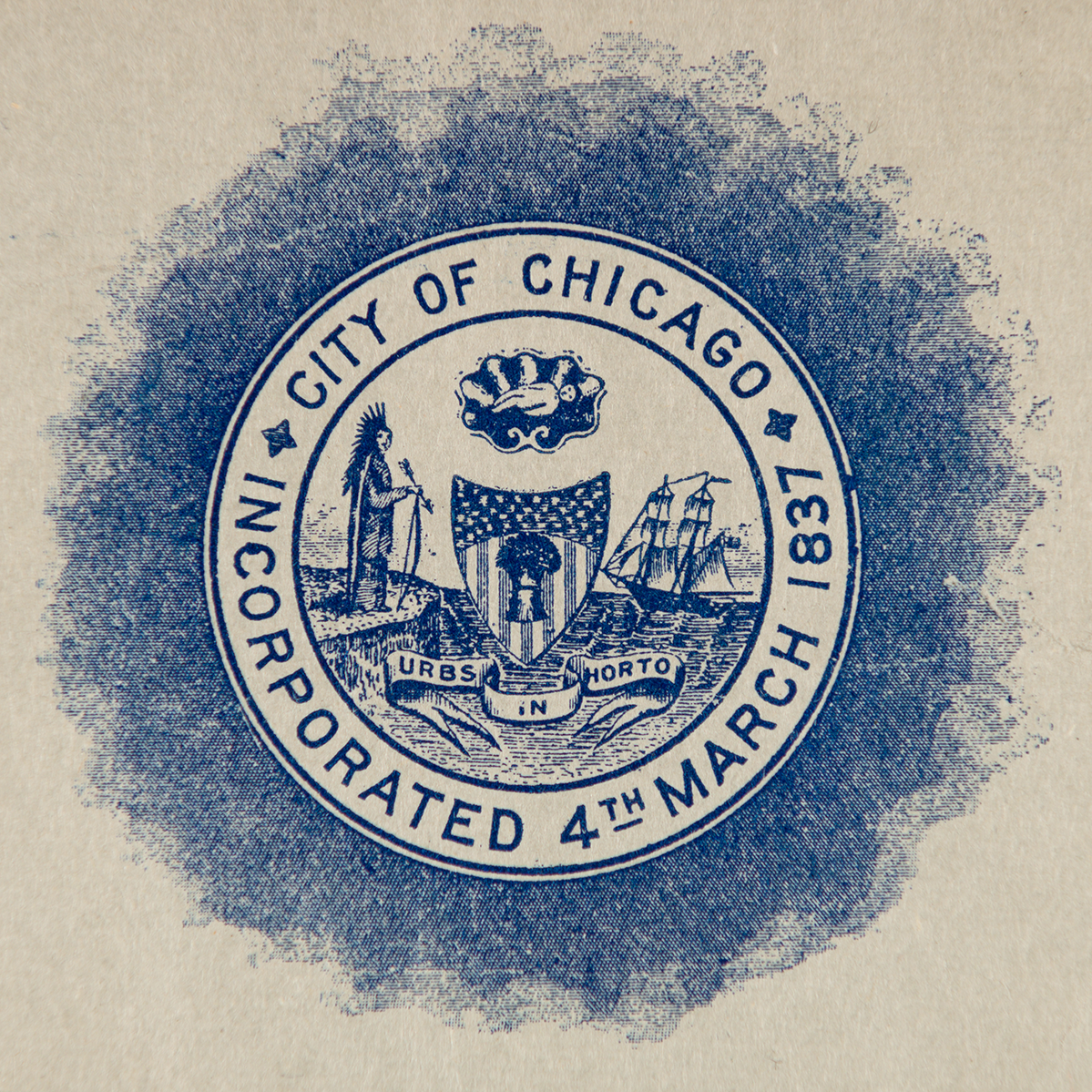
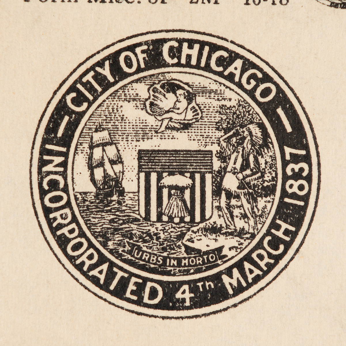
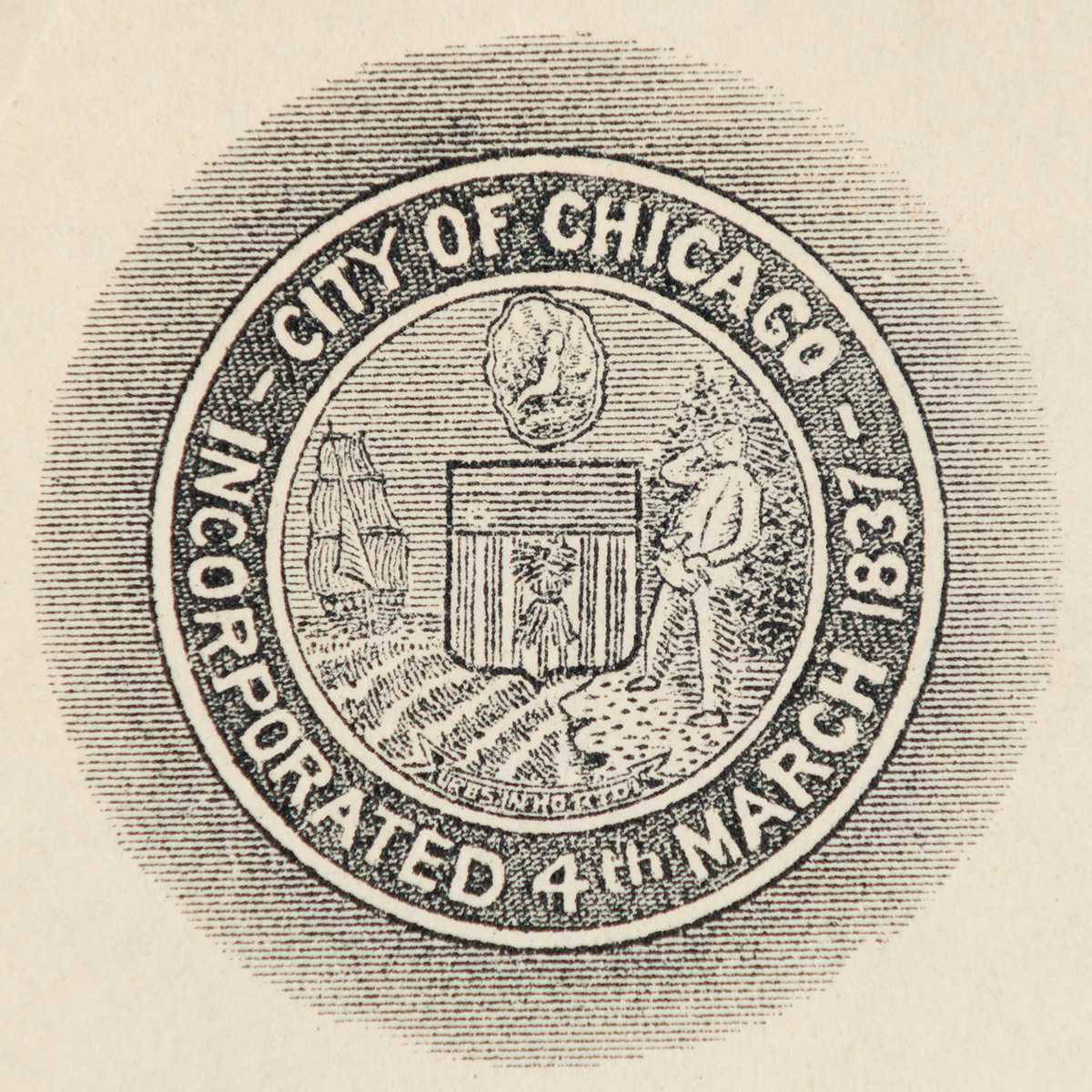
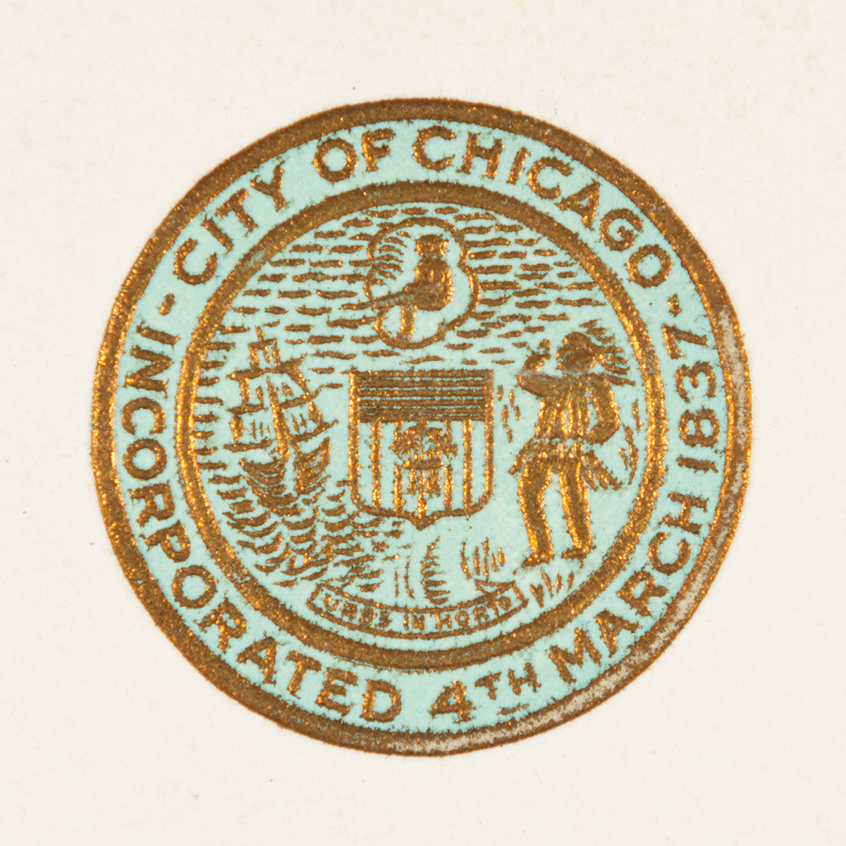
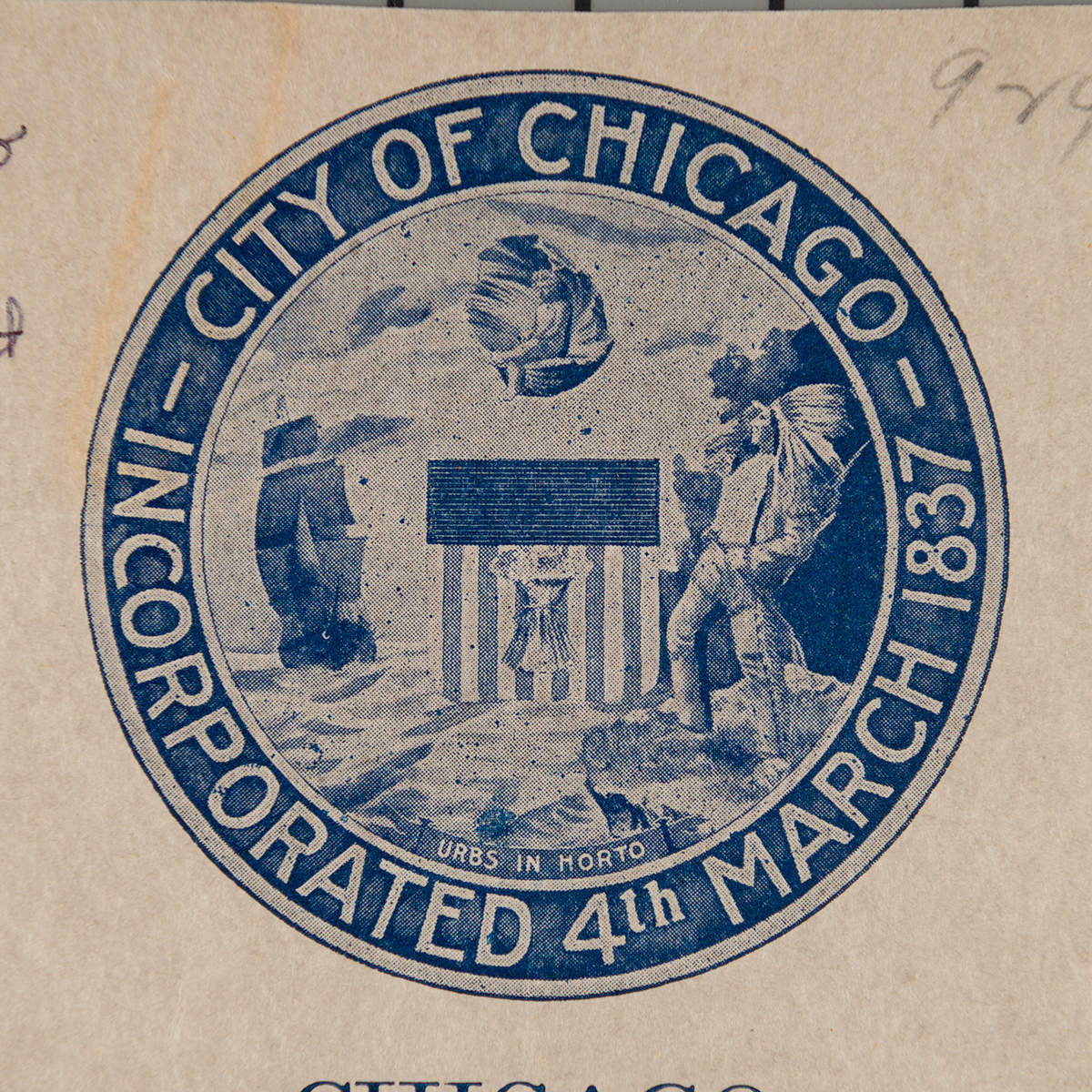
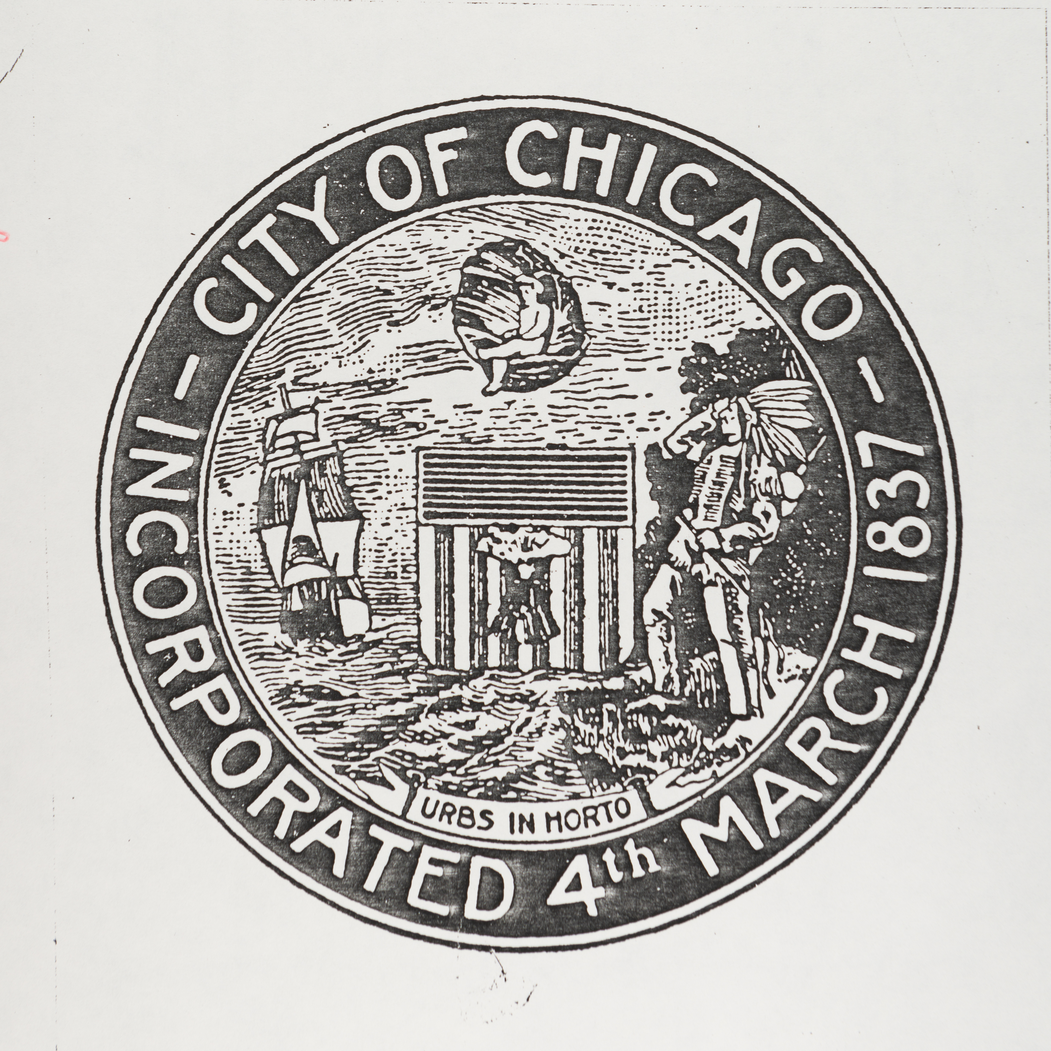
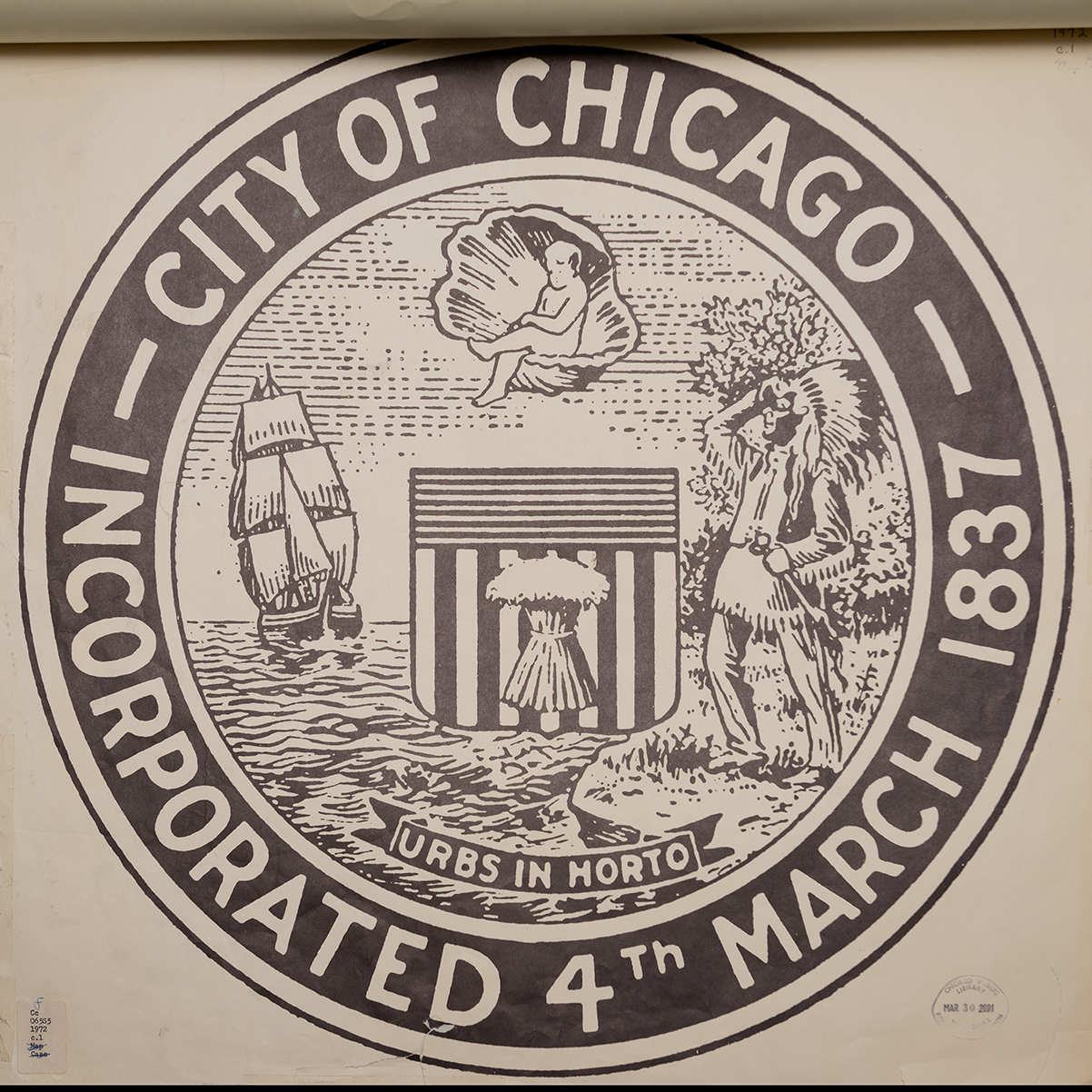
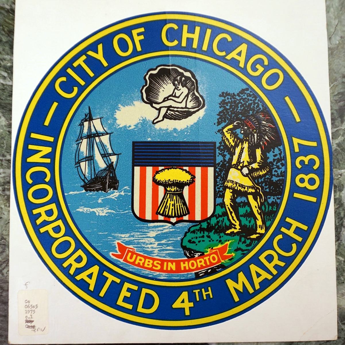
Below are examples of the Seal of the City of Chicago over time. Each opens a larger version in a new window.
